Kirby tribute for the King’s Birthday.
This is something of a follow-up to my post: Remembrances of Artists Past.
For me, the 60’s was an introduction to illustration and solidifying a foundation for drawing. I was at the perfect age to get swept up in the pop culture of the time. Bat-mania, Bond-mania, hot rods, surfers, creature features, the british invasion and California’s musical response to it. I was part of that baby-boomer bunch that assimilated all media (that was available at the time) and processed it by thinking that everyone should be able to contribute to it.
To that end, comics were the most immediately gratifying in that any kid could draw. What really seperated the good from the scribles of the majority was if you could stick to it and learn from others. Again, comics (and paperback covers) were a visual source anyone had easy access to.
As a youngster I traced for a little while in order to get the feel for making images of the folks that attracted me. Gil Kane was a master of great anatomical poses. He got the treatment. Carmine Infantino was another, especially because he would purposefully put art lessons in the back of Flash books. Kirby had wild ideas and backgrounds unlike anyone else.
I quickly graduated to copying rather than tracing. This made me analyze everyone’s techniques. By the time Neal Adams appeared on the scene at the end of the 60’s, I was old enough to appreciate his approach towards an overexaggerated realism. I thought he was trying to approximate the look of paperback covers in ink.
By the time the 70’s hit I had a neverending source of influences at the newsstands of any store. Drug stores were especially prized as they usually had large magazine racks and a fair amount of space dedicated to paperbacks of all types. Thrift stores were a great place to look through paperbacks as well. And of course back then you could find some huge used bookstores, as we had in Al’s Books on Van Buren. Sometimes you could score some reprints of old comics, Mad Magazines or newspaper strips in paperback form as well. Mostly though, I was fascinated by the detailed
illustrations of James Bama, Robert McGinnis (of course Frazetta) and their like on reissued pulp adventures or the multitude of spy/private eye adventures issued on the back of Bond’s popularity. This gave me the impetitus to experiment with more shading techniques than what the comics provided. But that was about to change.
Neal Adams used pencils-only in a couple of early 70’s DC storys for effect. Later Warren magazines were starting to get better distribution,
and pencils as well as ink washes art appeared there. It gave me something new to work at and a better idea of giving a sense of weight in art. Later in the decade, folks like Walt Simonson and Marshall Rogers brought a sense of design that hadn’t been touched on much since Steranko and Adams first experimented with it. They made the page itself something to be reckoned with before ever touching pen or pencil to it.
Things were changing after the beginning of the 70’s. Several trends were all working together to allow more exploration and experimentation by artists in publications. I was also starting to see the cross polination of artists and techniques in different venues.
The first trend was that comics embraced the pulps as much as the paperbacks had. Tarzan by Joe Kubert started at DC. This showed Joe in a new light to me. (I had avoided the war and western books as a kid. It reminded me of the plethora of them on TV that I had to argue time with my dad for.) More impressive was the John Carter of Mars backup that had Murphy Anderson and Gray Morrow doing wonderful work on. The Shadow also started up introducing Michael Kaluta’s style to everyone. (He was also working on a Carson of Venus backup in Korak and a Frankenstein’s monster backup in the Phantom Stranger.) DC quickly followed this up with a ERB’s Weird Worlds book that had Pelucidar tales illustrated by Alan Weiss. (Inks by the Crusty Bunkers, a cadre of inkers assembled by Neal Adams to help out with deadline issues, and coincidently, to give things an Adam-ish look. He was selling books just by doing covers and younger artists were beginning to ape him to get a foothold into the industry.)
DC was responding to Marvel’s success with bringing Conan to comics. One could quickly see Barry Smith’s evolution from Kirby clone, doing fill-in issues of Daredevil, to someone with a grander art view. (Or at least one that focused on other artists and was not just confined to the comics page.) Marvel took everything REH could offer as a character and exploited it in their anthology/mystery books. They took anything else that looked like it resonated with readers and ran it up the flagpole as well. Monsters? Check. Kung-fu? Check. Cyborgs? Check. This allowed them to essentially run “pilots” for titles. If they caught on, great, they graduated to their own title. If not, then on to the next thing. It allowed them to use some of the artists also working at DC and bring in others like Rich Buckler, George Perez, Jim Starlin and Al Milgrom. Adams set up shop with many of his proteges there as well. Howard Chaykin began over at DC with Swords of
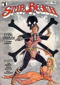
Sorcery. DC picked up the Fafhrd and Grey Mouser tales from Fritz Leiber in hopes that the Conan magic would rub off there. The first issues were inked by the Bunkers, so they all looked like Neal was doing them. Howard finally got to show his own style and the Adams intro probably helped me aclimate to just going with it. Howard went from this into eventually taking over (now just) Weird Worlds with his character Ironwolf, introducing Marvel’s War of the Worlds sequel starring Killraven (Bunkers inks there for Howard’s initial effort, then suffered through a ton of Herb Trimpe before being rewarded with P. Craig Russell), doing Cody Starbuck for Star*Reach (more on that later) which got him the job of doing Star Wars at Marvel as well.
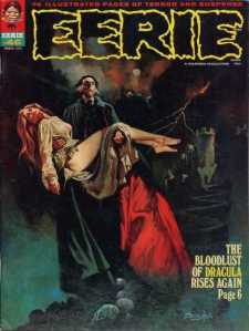
The Monster books I count as a portion of the pulp revival. (Hey, even the Kung-Fu book was connected to Fu Manchu. By the time Paul Gulacy’s art turned it into the most cinematical comic ever it was also channeling Bond. Also, Famous Monsters was getting much better distribution and even had competitors like The Monster Times and Castle of Frankenstein-both of which also covered comics.) DC and Marvel both arrived at their own versions of muck monsters almost at the same time. DC’s Swamp Thing was the gold standard with Berni Wrightson’s art. (Yeah, he made a great impression on everyone almost immediately. Myself as well. He’s a great one to learn about shadows and spotting blacks. Later he would be yet another inspiration for investingating fine line work.) Marvel was using former Will Eisner associate Mike Ploog for Man-Thing. He also single-handedly brought forth all of Marvel’s monster books except Dracula. There were some others that dabbled in this style, but not for long. For some reason it was commercial, but artists didn’t take to it like they did aping Adams. (Probably because they had to be able to take anything in order to break in and Adams style was more versitile while Wrightson/Ploog was very horror/creature oriented.)
The second trend was the effect of the undergrounds on the big two publishers. The artists working at the majors liked seeing the experimentation. The publishers were more concerned with the demographic they were reaching: college/university students. Whatever it was, it gave artists the opportunity to be much more psychadelic and bold in their approach to art. (Yes, even more so than late 60’s Steranko. By this time he was producing some very workman-like covers for Marvel and working on producing his own magazine covering all media.) This resulted in Kirby’s Fourth
world material for DC, which took his art, ideas and story telling skills to new levels. I never thought he was the same after these eventually all tanked. Over at Marvel the younger artists and writers took this opportunity to really run with things. Chief among these was the creation of Howard the Duck. Howard had art by Frank Brunner, one of the few to take a Wrightson-like art style and apply it to things other than horror. Howard quickly turned from quirky to mere satire. (Good satire for comics, but it ditched the weirdness for social commentary.) Brunner left and went to work on Dr. Strange during one of his more counter culture inspired runs. (It didn’t hurt that much of this was inked by Dick Giordano, Adams’ right hand man. It was like that issue of GL/GA that Wrightson inked. Neal and Berni on one page.) Even somewhat straight forward superhero books like The Defenders had wild goings on and ever stranger villians with art to match, usually inked by early Klaus Janson. (His slick ink lines as well as Tom Palmer’s were things I admired but had difficulty duplicating.)
An independent line that qualified as underground but actually used a lot of existing pros was Mike Fredrich’s
Star*Reach. (See, I looped back to that Chaykin reference.) It latched onto trends that the big two fostered and exploited them in ways that the comics code wouldn’t allow. SF, Ducks and barbarians. I think Brunner got a more rabid fanbase from this than his Marvel work. It also allowed Jim Starlin to do the more bizarre stuff that couldn’t fly in his take on Marvel’s Warlock.
I believe some of the underground esthetic was in effect at the National Lampoon as well. The difference was that they took the best from the majors to produce their parody comics. Adams, Wrightson, Russ Heath, Frazetta, Frank Springer, anyone that had a new or iconic style, as that was part of the parody. Meanwhile in the back of each issue they had their own “Comics” page, as in the newspaper variety. This introduced many to Gahan Wilson and Jeff Jones. Wilson carried on in the tradition of Charles Addams with black humor and Jones (Who started out with Wrightson, Smith and Kaluta) probably got unfairly lumped in initially as a Frazetta clone but was actually riffing off of romantic artists such as Gustav Klimt (among others). The production values were higher than any other comic (and the page rates were great as well) so the work was rather spectacular and inspiring.
The third trend was a side effect of the first two but directed to a new avenue. That was the ascention of the B&W comic magazine. Warren was the vanguard in this respect, but they were followed by Skywald and Marvel. (I believe Atlas during their short run produced a couple as well. They were not breaking the mold, just like their color books.) Just before these were making inroads to my personal (and apparently national) radar I picked up a paperback on Burroughs (E.R. not William) that had beautiful Frazetta ink drawings in it. (Reproduced from limited editions issued earlier.) I remember being sick and missing close to a week from school and just pouring over the pages. I began obsessively working on fine line illustrations. When it became easier to get the Warren magazines (and they also stopped reprinting material and producing new stories on roughly a bi-monthly basis) it was perfect timing as I was exposed to wonderful ink and pencil work from new artists (both domestic and foriegn) or appreciation for older artists that pushed me to new explorations.
As an aside, the single most influential thing to me from the Warren books was Rich Corben. He came in from the Undergrounds and slammed me upside the head. He was doing airbrush work on comics pages. It had a cartoony, yet
realistic look that today you could compare to the way many computer generated animations look. Even his pen and ink stories had a weight and weirdness to it. He was out there and it wasn’t just his love of including nudity in the stories. You were riveted even if it was the standard O’Henry twist type horror tale that Warren continued from EC. I went and picked up his underground work after I discovered him. (Thanks to the old, now departed, Royal Bookstore where I could always find Warren magazines, Monster Times, Cinefantastique and Mediascene long before other places eventually picked them up.) He became an obsession for a while for two reasons. First, since the 60’s I thought that there should have been an Alex Ross, or painted comics. I looked at the paperback covers for Doc Savage and the Batman trading cards and thought this is what should be represented on the interiors. Corben was the first glimmer of that dream becoming reality. Second, even his pen and ink material was so solid I decided to dissect it to see if I could do it and what it would do to my work. (Partly successful, but he would play into an ‘aha’ moment years later when I began working with prisma color pencils over marker washes.)
While these three trends were moving along, an invisble one snuck in: cost control. Production had ramped up to include a lot of books that were not in the core competancy as decreed from the 60’s: superheroes. New artists and writers had to be brought in because of this, changing tastes in art and the aging of the old guard. Adams clones were expensive, even if they were underpaid. Everybody came to the same conclusion: Spanish and Filipino artists. Even at DC, which didn’t delve into the B&W thing much, they embraced it as a way to break the rise of the American talent. (Spearheaded by Neal Adams. The publishers weren’t used to having the hand that feeds bitten.) While this was a rough time for talent, it was a great time for lovers of illustration.
Warren started showing them first and because of the demand, many were able to jump to Marvel’s B&W line. Among
the standouts working in the B&W magazines were Jose Gonzales, Luis Garcia, Esteban Moroto, Vincent Alzacar, Jose Bea, Pablo Marcos, Alfredo Alcala, Aureleon, Gonzalo Mayo, Luis Domingo and Ernie Chan. Enrich and Sanjulian did beautiful oil painted covers for the Warren books. Luis Garcia had this
wonderful loose pencil line that coalesced into detailed realistic drawings. I worked on that line for a while. Alcala, along with Wrightson and the great Reed Crandall totally had me vigorously pursuing pen line work. There were some folks that made the jump to color comics. Moroto, did some and Marcos was a regular inker at Marvel for years as well as Chan and Alcala.
Some folks landed at DC and showcased their talents pretty much there exclusively in their color books. Nestor Redondo took over Swamp Thing and the ink line work was so great that I didn’t really mind much. (He did do some things for Marvel later including some gorgeous painted covers for Savage Sword of Conan.) Alex Nino was all over the place at DC and I think he helped make the Anime style palatable for many with his style that touched on it, but did not emulate it. I admired the flexibilty his characters showed. It was like they were inked quick sketches of extreme life study poses. Tony DeZunigia created Jonah Hex’s
unique look and helped make that character a hit as well as the Black Orchid. He ended up leaving DC and went over to Marvel inking Conan and Doc Savage, both in color and B&W. The B&W had some terrific ink wash over it with some real painterly flourishes on occasion. Ruby Nebres could be counted on to provide full art or ink a silver age master like Gil Kane.
Marvel produced some of their best art in the B&W arena starting right out of the gate with Savage Tales. The first issue had the initial Man-Thing appearance by Neal Adams and was a
trial to see if Marvel could crowd in on Warren’s territory. It was a natural extension of the Conan and REH characters branding to go for a more mature approach. Barry Smith had pushed the envelope as much as possible in color and with the comics code stamped on the cover. His style had also changed to the point that he was visually referencing romantic fine artists in his inking style and more naturalistic figure posing. He was also at his peak of popularity, so he drew a pretty good crowd to the magazine. It definitely helped launch the line and proved an effective test of a different area of newstand distribution. (If anything it gave them access to more areas, as not everyone had a comics spinner, but they most assuredly had a magazine rack.)
Alas, Smith decided to leave comics at that time for more proper illustration. (I believe at that time he was also working with Oliver Stone on artwork for The Hand.) John Buscema took over and he provided plenty of material for both color and B&W thanks to only providing layouts many times and having one of the Filipino artists finish it. Having broken into the market, Marvel followed their color marketing strategy by putting out as many titles as possible to overwhelm any competition. (DC really never had the basis to enter this arena. Kirby explored it, but it just wasn’t a good fit for DC at the time.) Marvel quickly spun Conan off into his own B&W magazine (with the other REH characters) leaving Savage
Tales to star their Tarzan clone, Ka-Zar. Marvel took their monsters and started a Dracula title, a Vampire title, a Monster title for everyone else, a Kung-Fu book starring Shang-Chi and a SF book. Some American artists were able to turn this to their advantage even while the Filipino artists were making their mark. Neal Adams and his Crusty Bunkers were very busy in the early stages of all of these magazines. Adams himself was doing some outstanding painted covers to nudge sales. (I know it got my attention. I was more than a little curious about his technique.) Boris Vallejo got his start doing covers for these (as well as some work for Warren and Skywald). Joe Jusko and Earl Norem began showing up there also.
Marvel also took anything from their existing lines that might have an edge and decided to go the B&W route with it. Doc Savage and The Rampaging
Hulk appeared and were actually quite entertaining. (The Rampaging Hulk also started Moon Knight back ups that were perfect in the B&W format.) They used their strategy of “pilot” books and tried to see what a more adult approach to The Punisher would be like. (Interesting but really didn’t take until the MAX era much later. Too bad.)
The B&W stuff really appealed to me. Without the flat colors of the newsstands, these books let the artists really render using a variety of tools. It was a constant source of inspiration and exploration. This was happening as I entered high school and could actually take art classes where I could apply these techniques on assignments. It also gave me the ability to start to make the connections between illustrators and fine artists. (And see how blurry that line of demarcation was.) I was lucky enough to be able to borrow a copy of Burne Hogarth’s Dynamic Anatomy from an art teacher. It was an amazing realization to see the posing and rendering along with the obvious line tracing back to classic fine artists such as Titian and Michelangelo. I was also able to start working in acrylic paint and oil pastel. I frequently looked to the covers of the B&W magazines for lessons in color theory and techniques. I found the foriegn artists especially called back to the past masters but with a more contemporary look. It made some of art history much more relatable to me.
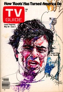
I also saw my favorite illustrators were showing up in other places and it helped me to discover different artists working in those areas. First among those was the old TV Guide. We had a subscription (ridiculous considering the lack of channels back then, but…) and there was frequently an illustration as cover material. You could always count on frequent Mad contributor (and former EC/Creepy #1 cover artist) Jack Davis for a few. (I loved his caricatures but never felt the need to try to emulate his style.) Then we got into the illustrator’s hall of fame
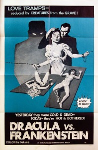
members like Bernard Fuchs, Richard Amsel and Bob Peak (among others). Newspaper ads would catch my eye, and while they were not signed, I would try to figure out who did the art. Film posters I gravitated towards naturally, being a film buff, but more importantly, in the 70’s illustration was put to great use to sell them. The aforementioned from TV Guide would show up as well as some favorites from the comics world.
All in all, the 70’s was my personal “Golden Age” of illustration and a self taught school in one big decade. By it’s end the B&W magazines were struggling. Heavy Metal had come out towards the end of the decade and it’s slick paper and use of
color for airbrushed (Corben had moved to a bigger stage.) or painted stories was difficult to compete with. Warren had tried by featuring a color insert in their books, but the production costs were cutting down the gains they had achieved by employing foriegn artists. Marvel cut their titles back and, along with DC, started using their color line to explore non-code sanctioned adventures. (The direct market had started up as well and the familiar boutiques, or dungeons, known as comic shops began openning up.)
Was it better? Argueably, in the better thought out stores such as the original
incarnation of The One Bookshop across the street from ASU. It was a place you felt was worth the trip. There were no fanboys gathering about geekily scaring off customers. It looked like what it was: a niche bookshop, with comics and SF paperbacks. The owner, Paul Freeman, looked like a professor (Right down to smoking a pipe in the store, which actually brought back memories of old time smoke shops, another haven for large magazine stands back in the 60’s and 70’s.) and had a calm demeanor with a professional attitude
towards customer service. Contrast that with today and you can see why women don’t embrace this hobby/lifestyle the way content creators would like them to.
The 80’s brought their own challenges and growth as far as my relationship with print and how it effected my art. College and University matters expanded some viewpoints and brought into focus prejudices and attitudes towards others. It really wasn’t the same and while invigorating, not nearly as fun.
Why is it that the supporting characters in these animated films are most interesting than the main protagonists? In the new Alpha and Omega I was rooting for the Goose (Larry Miller) and the Duck to totally hijack the proceedings.
Similarly, in the Madagascar films King Julian and entourage along with the Penguins are far more interesting and entertaining than the three main characters. (As evidenced by the fairly good Nicktoons spin-off.)
Side note: Big name celebrities voicing the characters is a waste of money. Use real voice actors and concentrate on writing. (The only time I’ve seen a celebrity earn their pay as voice talent was James Woods in both Hercules and JLA: Crisis on Two Earths and David Spade in The Emperor’s New Groove. All seemed tailored for them particularly.)
I’m not sure what critics were expecting from a film of The A-Team. Apparently some went in thinking it was The Thin Red Line or something. The reviews that bash it hold it up to a standard that nobody in the audience is expecting.
It’s the A-Team on a summer movie budget. Bigger explosions and better fights. Were they expecting a dissertation on violence in the cinema? Were they pissed because Bradley Cooper and Sharlto Copley carry the thing more so than anyone else?
Whatever. You know if you want to see it, even if it’s because this is one of the worse summers in film history and you’re bored to tears with nothing else to see.

